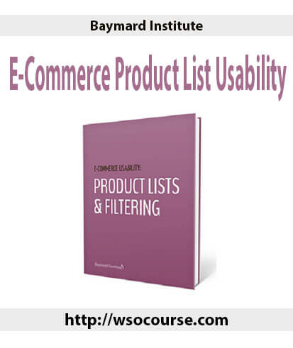
Baymard Institute – E-Commerce Product List Usability
$200.00 Original price was: $200.00.$49.00Current price is: $49.00.
Proof of item:
Product Lists & Filtering Usability
Exploring the customer’s product browsing experience
An original research study by Baymard Institute
After months of user testing and research, the most in-depth usability study on e-commerce filtering, sorting and product list design is ready.
Full access to the Product Lists & Filtering Usability study includes both a 502-page report with 93 actionable guidelines, and a benchmark database with more than 4,000 UX performance scores and 3,300 implementation examples.
This research-based and pragmatic toolset will help you achieve the best possible product listing user experience and conversion rate.
Report: 93 Research Driven Guidelines for Product Lists & Filtering Perfection
This original usability study focuses on how users browse, filter and evaluate products in e-commerce search results and category pages.
A group of users age 21-56 were recruited to test 19 leading e-commerce sites across 8 different verticals. Despite testing multi-million dollar sites, more than 700 usability issues related to product lists, filtering and sorting, arose during testing. All these issues have been analyzed and distilled into 93 concise guidelines on product list usability.
From this research study you’ll learn what users expect as they interact with product lists on e-commerce sites, what typically goes wrong in the process, why it goes wrong, and exactly what changes to make to avoid these issues. In short: how to design a high-performing product list experience for your users. After all, if users can’t easily browse your product lists, they can’t easily find what they are searching for – and if they can’t find it they can’t buy it.
What you’ll get in the Homepage & Category report
93 research-based design guidelines divided into 6 categories.
139 user quotes illustrating how users think when looking for products on e-commerce sites.
500+ images from the test sessions for detailed insights on product finding issues and solutions.
17 case studies of production sites illustrating what works and what doesn’t.
502 print-optimized pages exploring the user’s product finding experience.
Benchmark: Are Your Product Lists & Filters Better than Macy’s or Amazon’s?
Based on the findings from the research study we’ve benchmarked the product list, filtering and sorting implementation of 50 top grossing e-commerce sites in the US. This provides you with a comprehensive benchmark database with 215 pages reviewed, 1,100+ screenshots, and 2,200+ examples of the 93 product list usability guidelines.
The benchmark database is fully integrated with the report and comes bundled as part of the purchase, providing you with 50 case studies from the top e-commerce sites, acting as examples and inspiration on how to implement each of the 93 guidelines in the report.
Furthermore the benchmark database provides an interactive tool for you to review your own site (or your client’s) and compare it directly against the top e-commerce sites.
What You’ll Get in the Homepage & Category Benchmark
Full unrestricted access to the benchmark database with product listing usability reviews of 50 top grossing e-commerce sites.
215 page designs for systematic design inspiration on a particular page type (Category Lists, Sort Tool, etc).
An interactive review tool to rate your own product listing performance and see how it stacks up to the competition.
4,000+ UX performance scores providing a detailed breakdown of product list and filtering strengths, weaknesses, and common mistakes.
2,200+ best- and worst practice examples, illustrating how to implement the 93 product listing usability guidelines.
1 review for Baymard Institute – E-Commerce Product List Usability
| 5 star | 100 | 100% |
| 4 star | 0% | |
| 3 star | 0% | |
| 2 star | 0% | |
| 1 star | 0% |
Sorry, no reviews match your current selections
Q & A
Related products
Internet Marketing
Internet Marketing
Internet Marketing
Internet Marketing
Jeffrey “BUNT”? Bunting – (Beta) DNA: Foundations(DNA Flagship)
Internet Marketing
Internet Marketing
Internet Marketing


Everything is awesome. Thank you. Great seller!! | Baymard Institute – E-Commerce Product List Usability